Richard Minino, or Horsebites as he is better known in the world of punk rock, is an illustrator and designer from Orlando, Florida. Growing up in the shadow of Disneyland and always drawing from a young age, he’s now one of the most well-known illustrators in the Florida punk scene – and probably the rest of the US, if not the world, too.
He’s well-known for his artwork of Florida-based bands, including Hot Water Music and Less Than Jake. Plus the ultimate event in the punk rock world – Gainesville’s The Fest – where he’s consistently produced incredible design year after year. But Horsebites isn’t one for keeping his design work close to home, he’s collaborated with bands from all over the world. Producing a load of great stuff for the likes of Bear Trade, Dead to Me, The Flatliners, Polar Bear Club, Strike Anywhere, Wank for Peace… the list goes on and on. I guess you could argue that having artwork designed by Horsebites – be it album artwork or a t-shirt design – is sort of a punk rock seal of approval.
Looking back over Horsebites’ Instagram feed, I found it really interesting to read about the album artwork he created for Strike Anywhere’s To Live In Discontent over 10 years ago. He states that he barely knew how to use a computer – let alone Photoshop / Illustrator / any other form of design application. He’s sure come on a long way since then! And anyway it’s not always about digital skills, he can certainly draw far better than I ever could (and I’m a designer too, y’know).
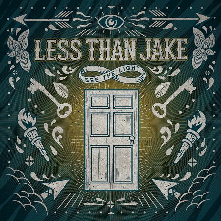
So far all of the designs I’ve shared are quite different, but some of my favourite of his album covers (that I’ve picked out below) seem to follow a similar pattern in terms of their composition. Using one central image with the band name and album title incorporated, with surrounding intricate details and shapes adding a level of complexity to the image as a whole. The designs often use borders and corner details which bring everything together and almost seem to hold everything in place. The artwork for Hot Water Music’s Exister and The Flatliners’ Dead Language, for example, use this sense of framing similarly, but without just looking the same.
However, Horsebites isn’t a… er, one trick pony (pun wasn’t intended, honest) as you can see with his recent artwork for Ship Thieves’ latest album, No Anchor. In terms of colours and texture it does have some similarities to the album covers above, but visually it’s really quite different. Still just as awesome though!
A lot of those album covers are fairly dark, but that’s not the case for all of Horsebites’ design work and certainly not when it comes to The Fest. Being over Halloween weekend, the visuals for The Fest have generally embraced this over the years but in a wide variety of ways – and anything Day of the Dead is amazing in my opinion. We’re planning on hopping over the pond for our first ever Fest (and first ever trip to America) this year and I can’t wait to get my mitts on a Horsebites-designed t-shirt.


No comments:
Post a Comment