

A Lesson In The Abuse Of Information Technology is one of my favourite albums of all time, by [probably] my favourite band too. Discovering the album in around 2010 or ’11 – late to the party, as it was released in 2007 – then led me to discover a load of other great punk bands. Although I knew a few before that, I feel like The Menzingers truly immersed me in the punk rock world. Even when the brilliant On The Impossible Past was released in 2012, it took me a long time to declare my favour for it over ALITAOIT. Musically they are quite different albums, however, so it is difficult to compare them. A Lesson In The Abuse Of Information Technology could definitely be considered fairly raw in comparison, just as, I suppose, the artwork could. The artwork of course being what I want to talk about here – as this is art of punk!
The title of the album is quite a mouthful but it’s definitely memorable and has some awesome artwork to match. I’ve always wondered why none of the other Menzingers albums went down the more illustrative route for their artwork. The band always has really awesome illustrative gig posters and merchandise, so why not record sleeves too? For me, ALITAOIT looks far more visually interesting than the rest – especially Rented World (great album, musically, but I’m really not a fan of simply having a photo of the band on the album cover).


I think what I love most about the artwork for A Lesson In The Abuse Of Information Technology is that there is so much going on – which is perfect given the meaning of the album title. We’re force-fed so much information on a daily basis through television, the Internet and other forms of media – probably even more so now than the 9 years ago that the album was released. I’m not so sure of the relevance of the animals on the back cover, probably running away from humans destroying their homes or something…
The vinyl version of the album features artwork on the front and back (duh), plus the inner sleeve. It does feel a little bit like they tried to squeeze too much onto the side with the lyrics – putting an image, even knocked back a bit in opacity, behind so much text is never good. But, that said, it’s great that they had so much artwork to use. I do think the choice of colours is a little bit unpleasant (and they really blend in with my wooden floor in the photos) but actually unpleasant is probably what they were going for!


I recently got my hands on a copy of the 2009 4-track EP Hold On Dodge (thanks, Gunner Records in Germany) which also features artwork of a similar vein. I also particularly like the use of yellow/green-tinted photos on the inside of the sleeve (it’s literally just a piece of card folded in half – no glue) as it mixes things up a bit. Just to point out: When I said I didn’t like the use of the photo on Rented World, I don’t mean I don’t like or appreciate photography in general. And action shots of a band playing live will always be better than an almost-posed image. The typography is also much better for Hold On Dodge – like some thought actually went into it!
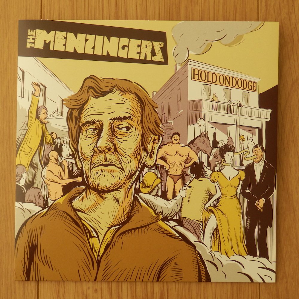


Both record sleeve illustrations are the work of Evan Hughes, who is a Scranton-based illustrator. He does some pretty cool murals and weird-looking sculptures as well, although it doesn’t look like he does so much in the world of punk rock anymore. But don’t let that deter you from checking out his stuff, it’s super cool.
Here’s to hoping album number 5 has awesome artwork more akin to A Lesson In The Abuse Of Information Technology than Rented World… but it probably won’t. And it’s all about the music anyway, right?
No comments:
Post a Comment