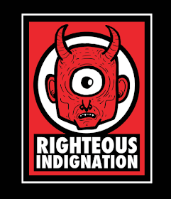
Iron Chic are a band that always have really distinct album covers and tour posters. Why? Because the man behind their artwork also happens to be Jason Lubrano, vocalist for the band. This means that he has full control and understanding of all things visual for Iron Chic. When Jason is holding a pen rather than a microphone he goes by the name Righteous Indignation and produces illustrations for (other) bands, record labels, zines, etc.
Righteous Indignation provides custom Layout and Illustration services for your band, record label, zine, business, organisation or whatever other things that might need it. Fine art commissions are also available so if you want ads, record covers, and posters or just a gross/scary monster to hang on your wall I've got you covered.
And ‘gross/scary monsters’ is a pretty good representation of Righteous Indignation’s style as he is a master of creating weird, wonderful and, yeah, quite grotesque creatures. Of course, the most memorable of these creatures is the fat, red, many-armed little creature riding in an, err, skull spider thing on the cover of Iron Chic’s first full-length album, Not Like This. Perhaps this is the Cutesy Monster Man?
With Iron Chic’s second album, The Constant One, Righteous Indignation uses another visual theme and it’s an odd one… creatures or body parts coming out of other creatures. Seriously, look at all these illustrations:
Righteous Indignation’s style is very graphic novel-esque, with thick black lines and, when not simply in black and white, bold colours. I don’t know if he’s done anything more story-based with his creatures and characters but it would be awesome if he did – I can almost picture it now! Also, note the Watchmen reference in the image below. I can really picture his creatures being produced as vinyl toys as well (Google that if you don’t know exactly what I mean).
Oddly their latest release, the three-track 7” EP Ys, sees Righteous Indignation step away from the scary monster theme. Instead of a monster Ys features an illustration of an astronaut that wouldn’t look out of place in the pages of a black and white comic book. It’s a great cover, well composed with simple typography and a black background that looks like it’s been lino or screen printed – a bit patchy and rough around the edges. But I’m sure the weird and wonderful creatures will be back because, let’s face it, that’s what punks love!


IRON CHIC?
ReplyDeleteDo you mean you
IRON ALL DAY??
I'm kornfuzed.
'Splain.